Thursday 7 May 2009

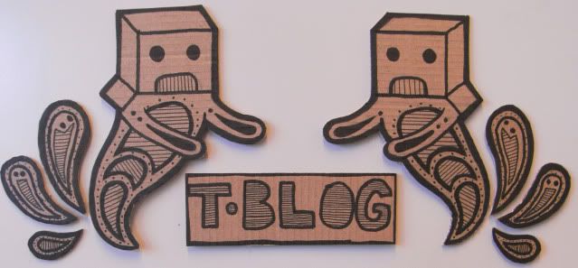
Off with their header


These are the stages I took to create my blog header. I had originally sketched the concept out before easter and had crafted them on e lonely wednesday night.
However, the photos I took had been "misplaced" and so I just took the initiative and took them again myself after looking at how dull it was.
I used cardboard, as I am hoping to develop my craft skills more and apply it to more of my design work.


Friday 1 May 2009

Loo-ndon Pt.2

Ok, I think its about time for me to organize my pictures into albums from my trip to London.
Here is the link to the pictures I took at the Rodchenko and Popova exhibition concerning constructivism, there was also a collection from the Domien exhibition thrown in, all pictures taken at the Tate Modern.
Photobucket
These will be updated, as I have at least 100 more to put up, these were things I saw all around and about, some nice work in the Brick Lane gallery too..
Photobucket

Thursday 30 April 2009

Re-proposing my first year experience

It became apparent that my previous idea of trying to help first year students to be more critical in their approach to work would be very hard, or in my opinion, very boring to do well visually. It also limited my ideas and confused myself into a scattered and unfocused concept.

So I decided to tackle a huge problem that still plagues the rest of the course and not just us, and the soon to be first years - TIME MANAGEMENT.
I chose this as I think it would be more beneficial to learn about time management from day one, rather than a third of the way through the course, as not only is it a professional practice, but if facilitated correctly, it can bring a balance to the new lifestyle that awaits them.

THE PROBLEM IS:
First year students may not be organised enough to appreciate the balance of work and play.

I AM GOING TO DO THIS ABOUT IT:
I will be informing the first years that by organizing/planning their time more effectively, they will not get swamped with work and reap the rewards from their efforts.

I AM GOING TO DO THIS ABOUT IT:
I aim to create an interactive, engaging and fun approach to managing time that can be transported from place to place by the student, is easy to access, and is easy to fill in, but does not feel like a chore. 
I will be using a combination of type and image to communicate this, as without the combination of the two, I dont think it will be done to a standard of visual impact.

Wednesday 29 April 2009

Trucking well good typeface


Found this amazing typeface/alphabet, thought it would bring a smile to someones face, as to actually get such good pictures of the trucks and to get a whole alphabet is something to be proud of!

Starting to speak from experience

After much discussion, debate, serious reflection and deliberation about the experience of being a first year and what I had learnt during my rocky baby steps to being a pro designer, it came to light that these were some of the main issues I found that had some significace to my ever growing curve of education.

1. Be prepared to make mistakes
2. Manage finances effectively
3."Dont polish a turd" - if its a bad idea, drop it!
4. READ THE BRIEF, READ THE BRIEF AND READ THE BRIEF
5. All nighter? All righty!

These were narrowed down from what was a list of non-specific, or loosely based componenets of a phrase, or rather bits and pieces of a bigger problem. I chose to be more towards real reflection of myself, and to make it more informed to the first years, as I spent alot of it confused, disorganised and uninformed in my ability to make decisions.

So to put some focus into how I am actually going to address/approach this brief, here is my proposal, or rather my first proposal of ideas.

What is the problem?

People are not objective/critical enough about their work.

What am I going to do about this?

Warn them about the potential dangers of not achieving the standard for a resolution or their work in general, inform them of the positives of evaluating and making informed decisions when working, and to advise them about choosing a suitable method to achieve this.

How am I going to do it?

To produce some form of introduction pack to help the first years to document, evaluate and learn tips on how to be more critical, so some form of calender with designers on each month that encourages them to be more independent with their studies, with a do it yourself style booklet that is pocket sized and easy to write in, along with a top tips book that has reference to aid the first year in making decisions.
Or possibly some form of blog/website that has all the information archived in it for eas of access that may be useful, especially when they have to keep a blog.
But obviously there is alot more research and idea generation to go before I start to do anything.


Monday 27 April 2009

In the Vallee of paper


After cruising quite a few magazines, and after a long session on his website, which by the way is something you could spend hours on, not getting bored. 
He has specialized in craft-based graphics, as he thinks that the overuse of digital design is taking away the aesthetics, and saying that digitalism sometimes overkills an image.

But I chose some of his work to put up as you can look at all his amazing installations and photographs of past projects on his website.


This is part of a montage/photoshoot/animation used for MTV:1 UK, if you scroll to the bottom you can watch the video.


MTV-One from Julien Vallée on Vimeo.

Thursday 23 April 2009

Typographic architecture


After finally visiting the website Lorenzo told us to have a look at - ilovetypography.com - I came across this amazing poster entirely handcrafted by Cameron Moll, using only letterpress and 100+ hours of effort.

Characters from Bickham Script Pro, Engravers MT and Epic typeface families form the edifice featured in the artwork, the Salt Lake Temple in Utah. It certainly has changed my view on type alone being used for image, as not only has it broken my perception of the simplicity of the communication derived from the single components of the image, but as the combination of many elements of type to create something so intrinsically magnificent.